TIMELINE
July 2026
PURPOSE
Side Project
TOOLS
Cursor
Figma
GITHUB
Overview
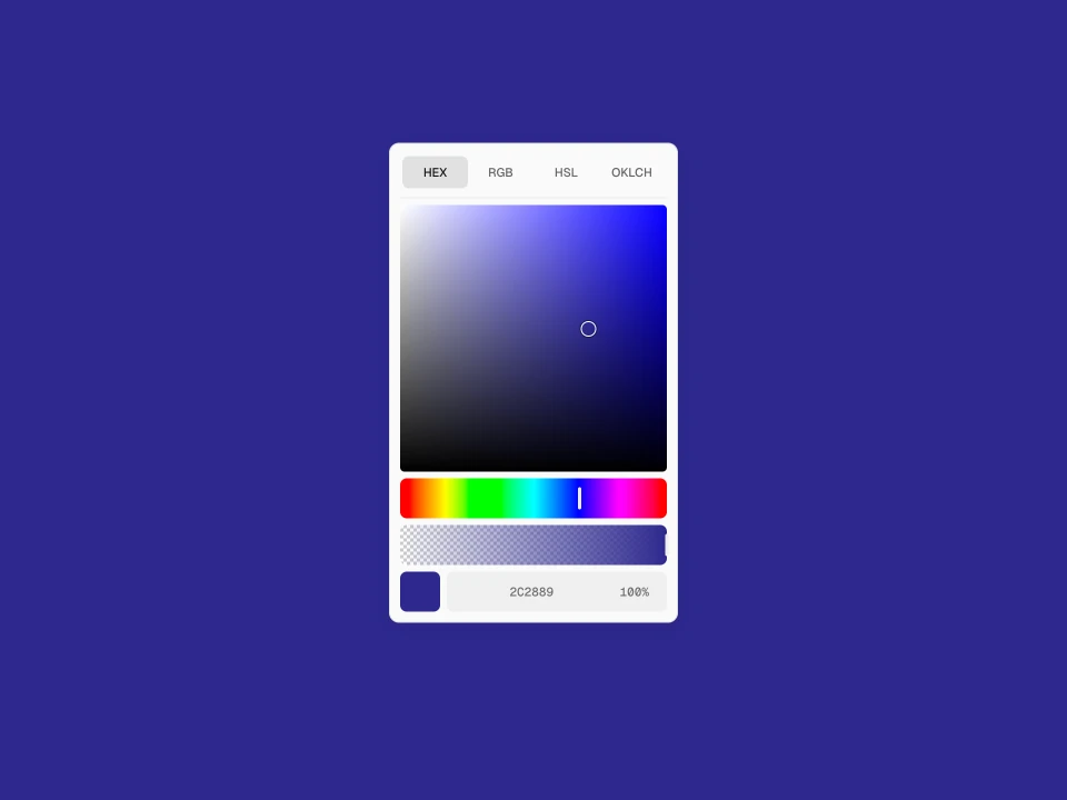
Pretty Color Picker is a clean, consistent color picker built as a native Web Component. Designed to match the quality of modern design tools with smooth interactions.
Demo link: https://colors.kiira.in/
The Problem
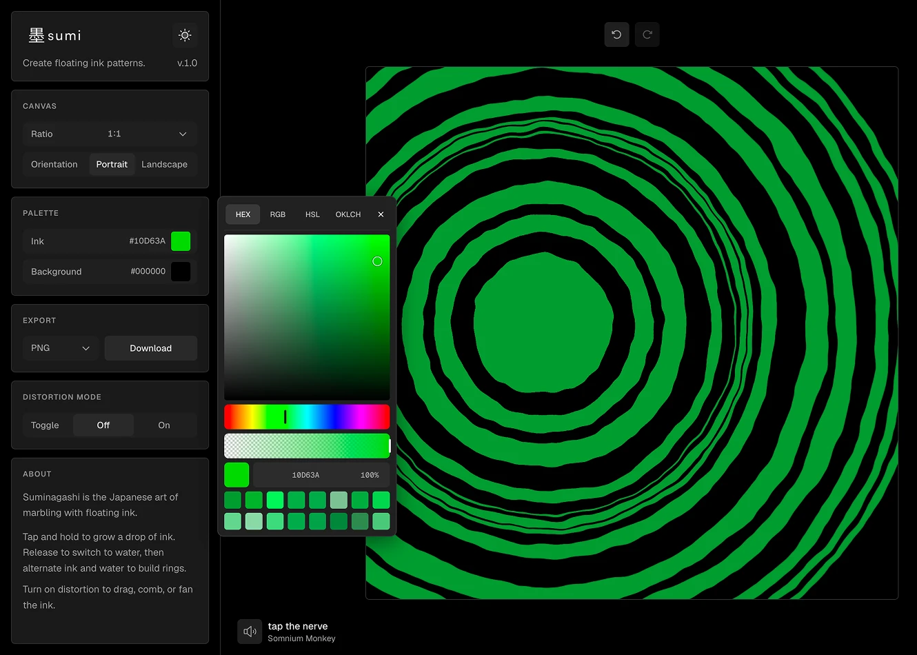
While using Josh Puckett’s DialKit, I noticed how disruptive the default browser color picker was. The native picker (especially in Chrome and Safari) looks dated, feels inconsistent across browsers, and completely breaks the premium, carefully crafted experience of the surrounding control panels.

The Solution
I built Pretty Color Picker from the ground up to solve this. It features a large, smooth gradient canvas, intuitive hue and alpha sliders, format switching (Hex, RGB, HSL, OKLCH), last used swatches, popover and draggable modes, and full theming support.

Features
Format tabs in the header: HEX, RGB, HSL, OKLCH
Saturation × value plane with a hairline loupe that stays visible at the edges
Hue and alpha as short dials, not thin sliders
Preview swatch aligned with the dials, and click to copy the active format
Compact value fields with drag-to-scrub
Last used swatches, no extra title
Popover mode anchored to a trigger, or a movable floating panel
Light, dark, and system themes
Colors stored internally as one source of truth; other formats are for editing and display
References
DialKit by Josh Puckett. Link
Tech Stack
TypeScript + native Web Component
Vite
Culori for color conversion
Shadow DOM for styling isolation
Published on npm as pretty-color-picker. No framework required.