Recreate the classic Twitter/X multi-image polyptych as a single PNG.

Recreate the classic Twitter/X multi-image polyptych as a single PNG.

TIMELINE

August 2026

PURPOSE

Side Project

TOOLS

Cursor

Figma

Overview

Tych lets you upload 2–4 photos, crop them precisely to the panel proportions, and export one clean image that looks like the old Twitter media grid.

Live website: https://tych.kiira.in/

Purpose

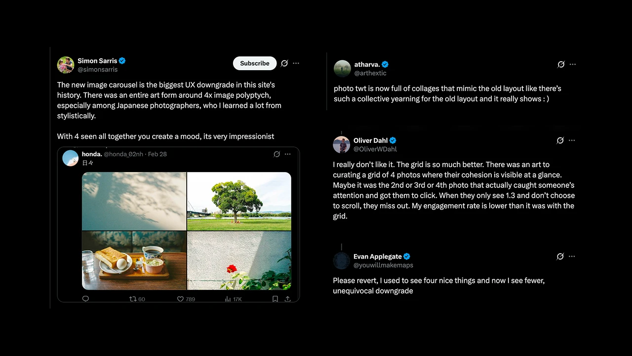
There used to be an entire visual language around 2-, 3-, and especially 4-image posts on Twitter. Photographers treated the grid as a polyptych: a single mood board composed of multiple frames seen together. The new carousel broke that.

Tych brings the visual result back as a single postable image.
Features
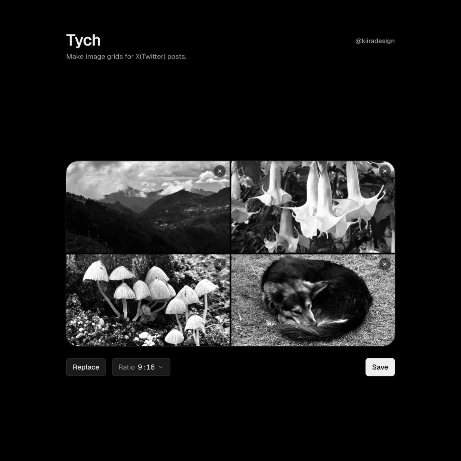
  • Choose 2, 3, or 4 images

  • Ratio picker — 9:16, 2:3, 3:4, 4:5, or 1:1 (rendered landscape; width is always the long edge). Default: 16:9 (900 × 506).

  • Per-panel cropping in a centered crop modal — pan, pinch, or scroll to zoom; what you see is what exports

  • Drag to reorder panels on the grid (swap by dragging one photo onto another)

  • Classic layouts:

    • 2 images → side-by-side

    • 3 images → one large left + two stacked right

    • 4 images → clean 2×2

  • Fully client-side. Images never leave the browser

  • Choose 2, 3, or 4 images

  • Ratio picker — 9:16, 2:3, 3:4, 4:5, or 1:1 (rendered landscape; width is always the long edge). Default: 16:9 (900 × 506).

  • Per-panel cropping in a centered crop modal — pan, pinch, or scroll to zoom; what you see is what exports

  • Drag to reorder panels on the grid (swap by dragging one photo onto another)

  • Classic layouts:

    • 2 images → side-by-side

    • 3 images → one large left + two stacked right

    • 4 images → clean 2×2

  • Fully client-side. Images never leave the browser

Adoption

Tych is now frequently used by photographers with large followings on X. It gives the viewing experience to X users as the time before the carousels were introduced.

  • Choose 2, 3, or 4 images

  • Ratio picker — 9:16, 2:3, 3:4, 4:5, or 1:1 (rendered landscape; width is always the long edge). Default: 16:9 (900 × 506).

  • Per-panel cropping in a centered crop modal — pan, pinch, or scroll to zoom; what you see is what exports

  • Drag to reorder panels on the grid (swap by dragging one photo onto another)

  • Classic layouts:

    • 2 images → side-by-side

    • 3 images → one large left + two stacked right

    • 4 images → clean 2×2

  • Fully client-side. Images never leave the browser

Tech Stack
  • Next.js 15 + React 19 + TypeScript

  • Tailwind CSS v3 + Geist + Dialkit

  • Pure client-side Canvas processing

  • Full-color PNG export with opaque black gutters

No backend. No uploads. No tracking.

Get in Touch

Get in Touch

© KEERTHI

LAST UPDATED ON 28.08.26

© KEERTHI

LAST UPDATED ON 28.08.26